Recently, a very good friend of mine got married. And you know I just can't buy a gift off the shelf.
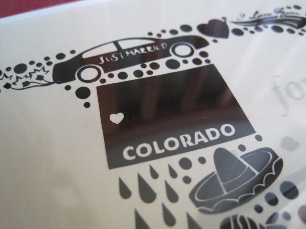
Maegan is a fun gal, and when she lived out here we used to have long conversations about life, goals, and whatnot. We were very much in the same situation - at the northern end of our twenties, busy with careers, etc so we really had a lot in common. I remember when we both volunteered at our local church temple and whoever left first would find the other's car and leave a note with a big "HI FRIEND!" scrawled on it. However, about two years ago her work moved her out of the area and then ultimately to Colorado, so our friendship has been limited to phone calls and texts since then (sadness). We tend to believe that everything happens for a reason, and her being moved out to Colorado is what put her in the path of Ben. I only met him the evening before their wedding, but from our conversations I could tell that he was a good guy and made her happy. And so the rest of us were happy.
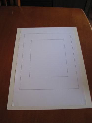
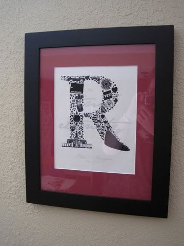
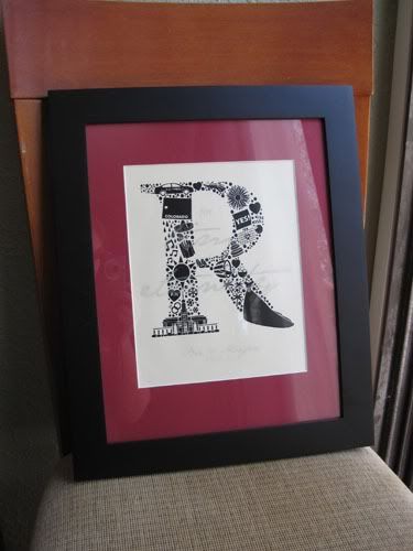
And so, being the creative person I am it came necessary to create a gift. After some conferring with Maegan, we settled on a wall hanging. I hemmed and hawed about a lot of different options, and finally settled on a distinctive R-initial (first letter of their last name) fronted by a message etched into the glass of the frame. I've known Maegan for quite some time, and this provided a great opportunity to really create a personalized keepsake for her and her husband. I knew that if anyone would cherish that level of detail, it would be her. This project is quite easy and takes well to modifications, though it does require some specialized equipment, such as a diecutter and mat cutting tools. However, I'll offer mainstream alternatives as I go if you want to make one yourself and don't have access to those tools.
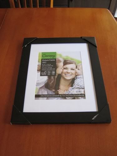
To begin, I sourced a simple frame that would mesh with Maegan's personal style and then measured the picture area. I'm using a 11" x 14" frame here (you can use whatever size you want, but mine needed to be FedEx friendly).
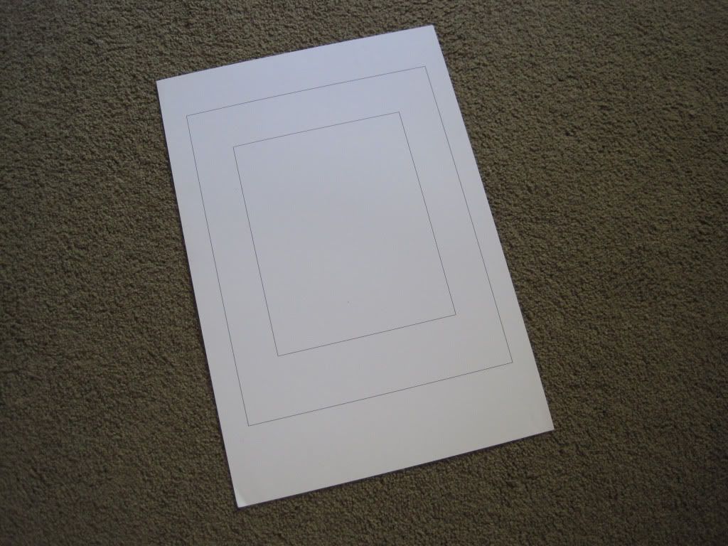
I then transferred these measurements of the picture area into Adobe Illustrator, a vector drawing program that is one of the go-tos for graphic designers such as myself. Not being the best mathematician, I find that mocking up my layouts in Illy allows me both the opportunity to make visual adjustments and achieve exactness in measurements. Unfortunately, there are few good alternatives to Illustrator - Corel Draw and Adobe Fireworks are what comes to mind - so you can always revert to good old graph paper if you don't want to shell out some dough for vector software.
Here I began to build my design, starting with the backing and then matting that I will cut, keeping in mind that my diecut artwork cannot exceed 8" wide (and thus, I need to size my mat accordingly). If you do not have access to mat cutting tools you can always buy a pre cut one, or get a frame that includes one and base your design off those measurements. Framing shops also seem to offer custom mats for somewhat reasonable prices.
This project strongly relies on layering and the visual effect it creates, so I present the build up of my creation:
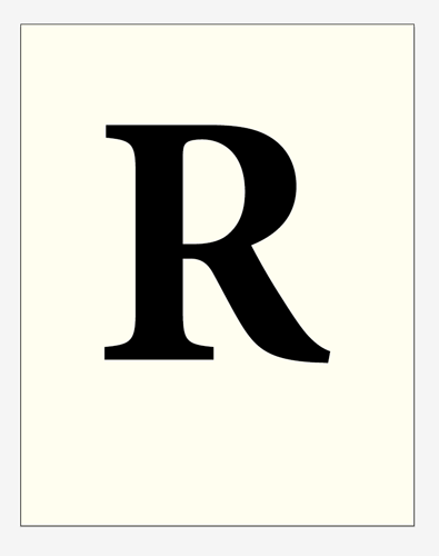
Backing:
R-initial:
Matting:

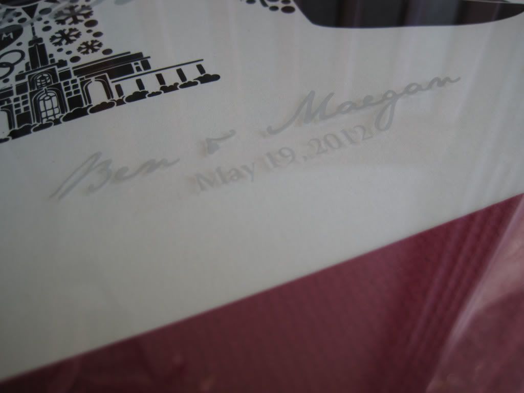
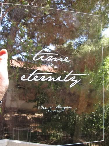
Glass with etching:
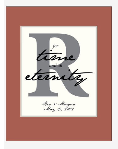
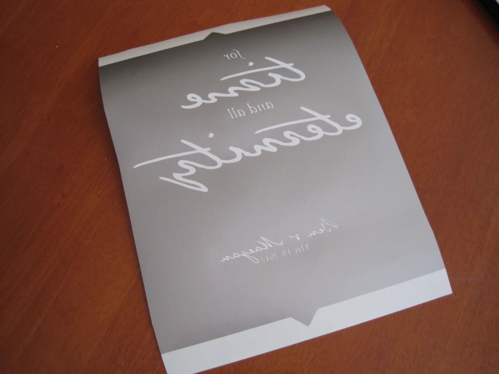
A note here - if you haven't figured it out already, I'm LDS and so are my friend Maegan and her husband. The phrase "for time and all eternity" refers to our concept of eternal marriage, in that marriages and families can remain together in this life (time) and the life hereafter (eternity). It's a pretty big deal to us and families are a foundation to our system of faith. Those marriages are preformed in our temples and are called a sealing, in that through this ceremony, the couple is "sealed" together for eternity. It is quite an honor to be invited to attend a sealing, and two other friends and I had the opportunity to travel up to Utah to attend Maegan and Ben's sealing.
But back to the topic, any wording can be used here - a meaningful poem, quote, or phrase. This is just what was appropriate for this particular wedding :)
You might also notice that I made my mat margin slightly thicker at the bottom than the top (by a half inch). This is done to give the bottom of the piece some visual weight and substance. Handy trick, but you can keep the top and bottom even if you desire.
So, therein lies the basic structure of the piece. But, it's kind of generic. Let's have some fun :)
I have always admired the Unilever logo and how the U is made up with pictures of other things. In searching for this image, I stumbled across a very interesting explanation of the logo, available on their website.
![]()
The Humane Sociatey of the United States does the same thing, with a more obvious correlation between the logo elements and the overall message. Heck, I even saw this method used on an ATM graphic recently.
![]()
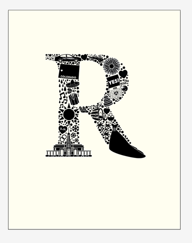
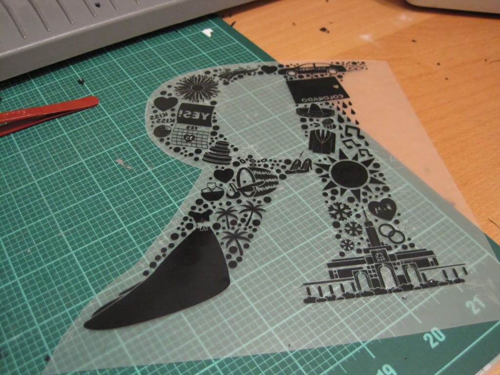
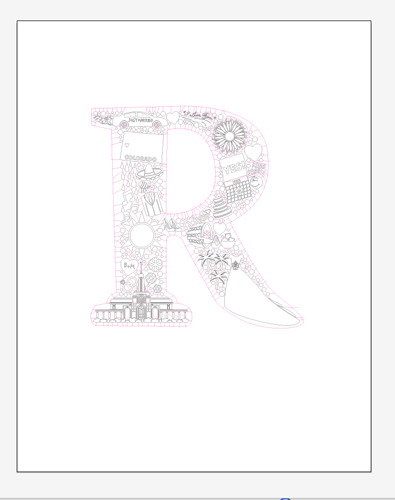
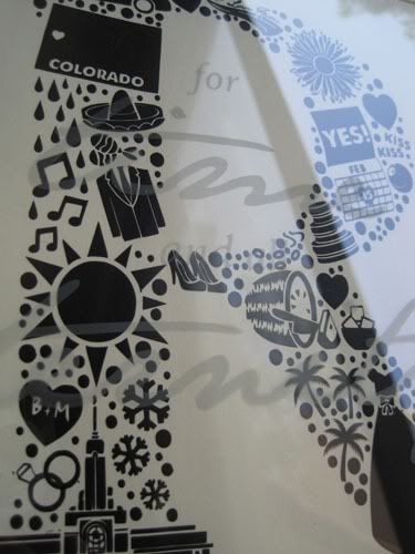
With this in mind, let's fancy up that R with things that have meaning for the happy couple.
I used Illustrator to create all of this, but you can certainly use one of the previously mentioned drawing programs to create it, or even achieve a beautiful effect by inking/painting it by hand.
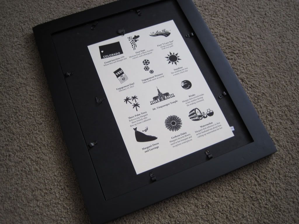
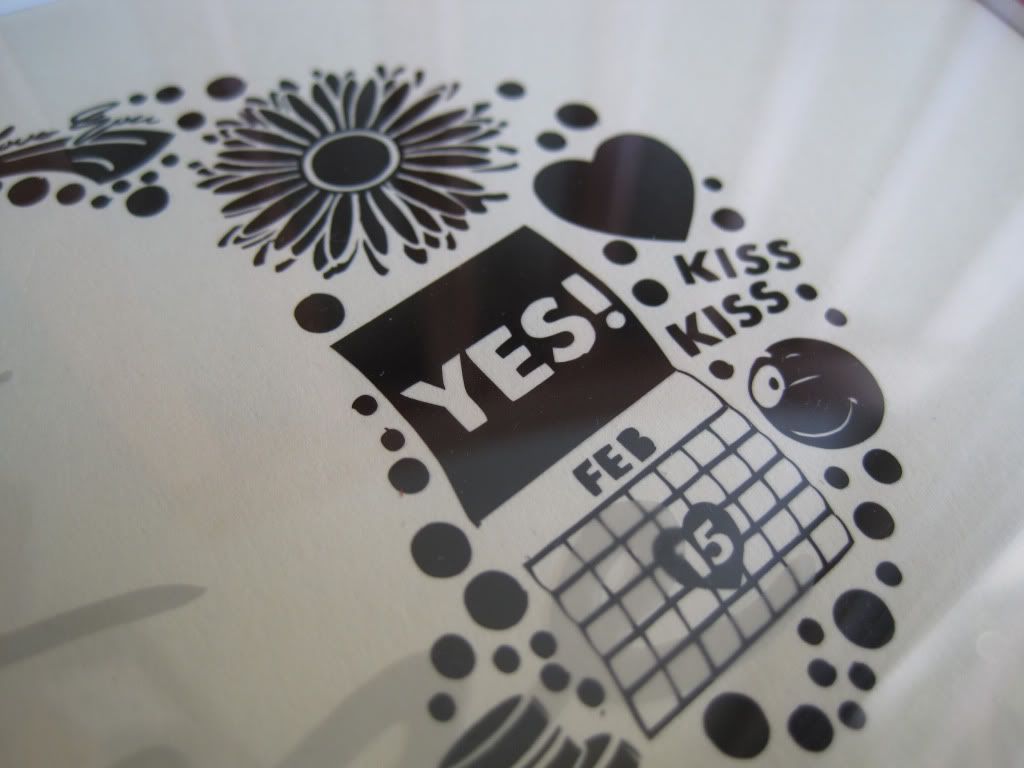
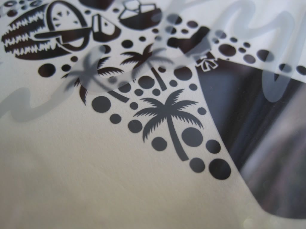
A few fun explanations of the items included in the graphic, which I will include with my gift packaging:
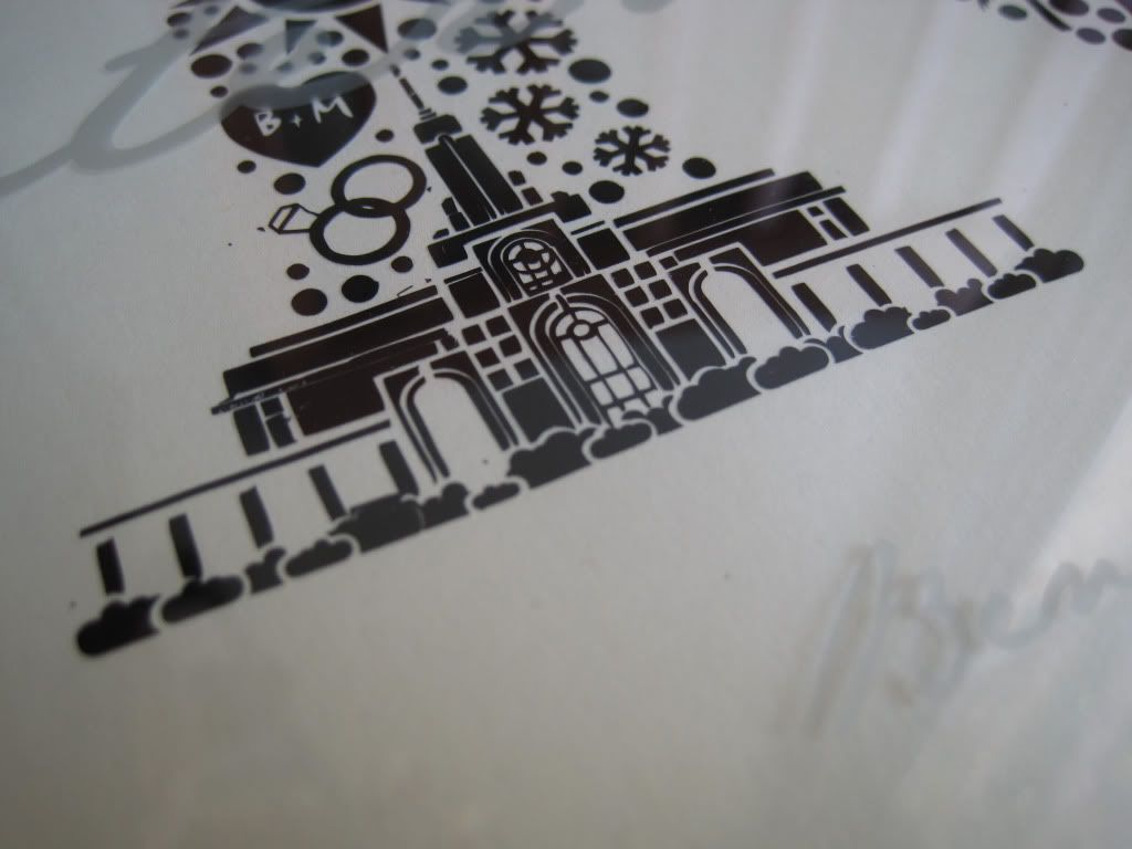
Mt. Timpanogos Temple - where Ben and Maegan were married

Gerbera daisies - Maegan's favorite, and a main character in her reception's floral decor

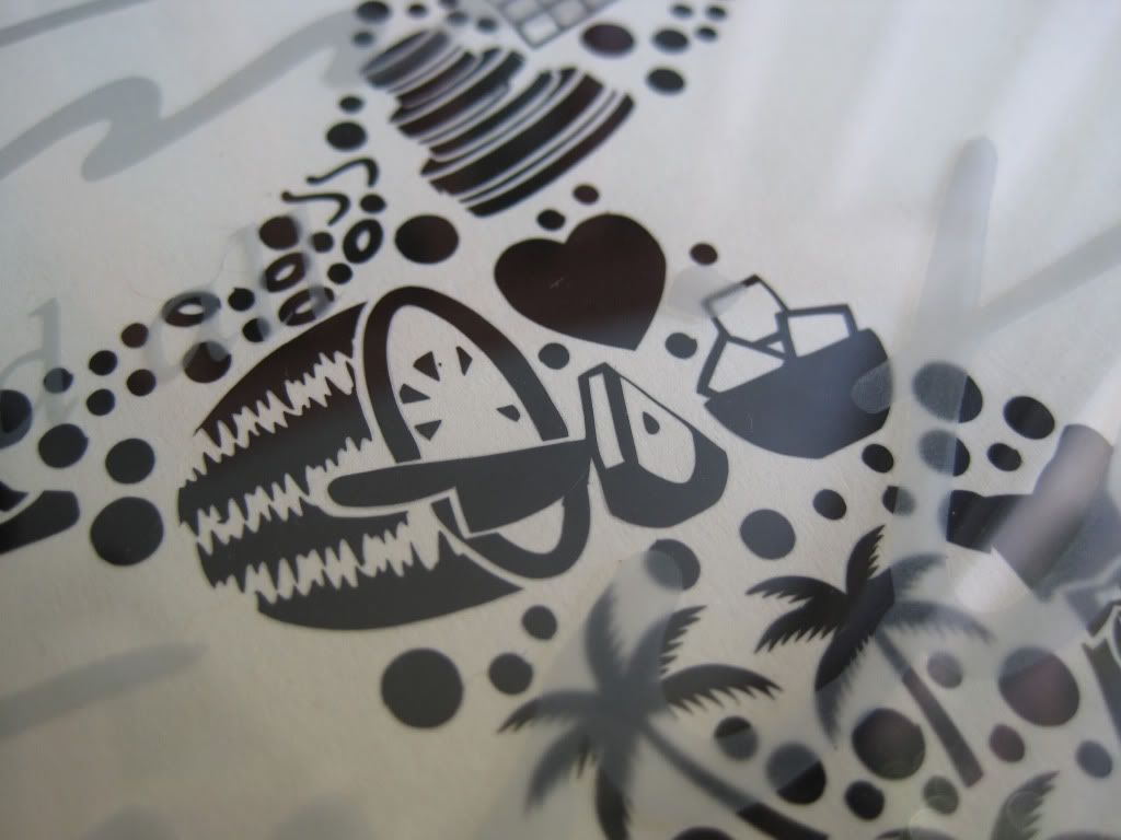
Watermelon - odd, but Maegan's first public reference to "husband" was about how he was being sweet and cutting up watermelon for her

Three palm trees - referencing the three of us who flew up to attend (hey, gotta get myself in there somehow ;)

And so on and so forth. Just about everything in there has meaning.
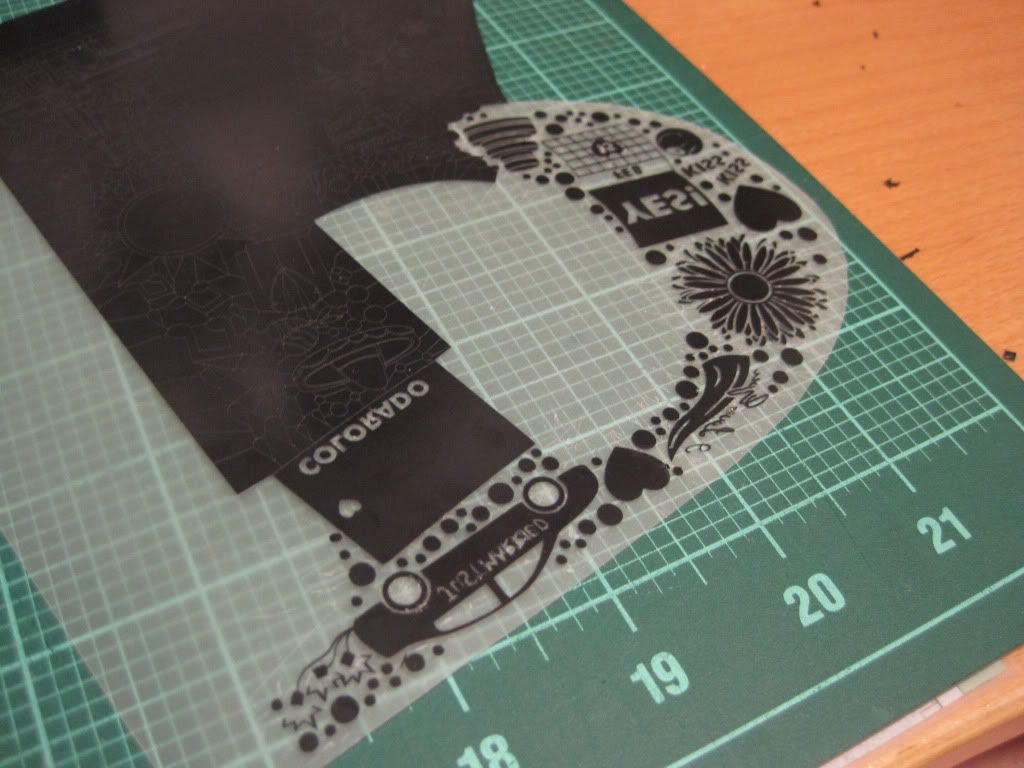
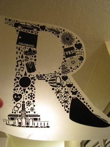
Next, it came time to get this artwork on paper. Here is where I admit that this process made a fool out of me. I had planned all along to use heat transfer vinyl through my diecutter to give the artwork some texture while being easy to do. However, because my design is so complex most of the "preferred" materials I used refused to cooperate, much like how when a toddler needs a nap the most is when they refuse to go down. Home diecutters can only achieve a certain level of precision, and my design was too complex to begin with. I needed to simplify it a bit. Don't do what I did.
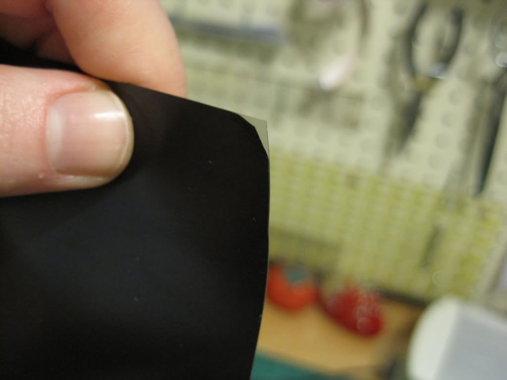
However, I did have luck with a nice, thin vinyl. It took some cajoling, but I got it to work.
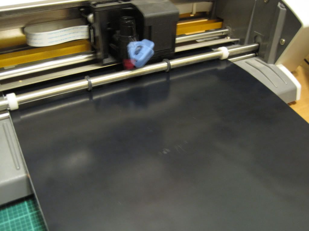
If you're unfamiliar with the diecutting process, here's a quick view of how it works:
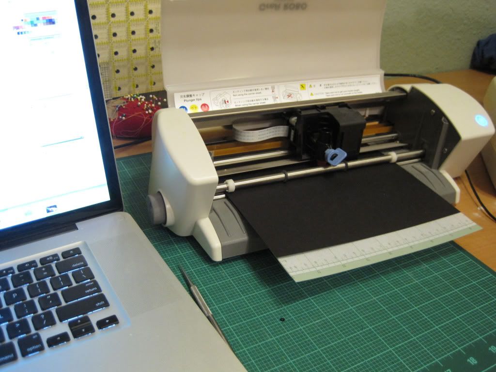
This little bugger is a CraftRobo CC200-20 (discontinued, I think), which is very much the same idea as a Cricut, but instead of pulling its cutting patterns from preprogrammed cartridges, it runs from vector artwork created in Adobe Illustrator. Essentially, I can cut anything that I can draw and only be limited by size and tolerance of materials. Pretty cool. It looks like a small inkjet printer, where the carriage that would hold the ink in a printer instead holds a cutting blade and little servos that control its rotation. It whizzes back and forth over the material to be cut, and side grippers move the material in and out of the machine, as the cutting carriage is limited to left and right plane of movement. It really is fascinating to watch, in fact, you can see mine in action here in a video I made to help someone with the registration marks feature. Yes, it really is that noisy, especially when cutting curves or dashed lines.
Here it is in action, cuttin' some stuff up.
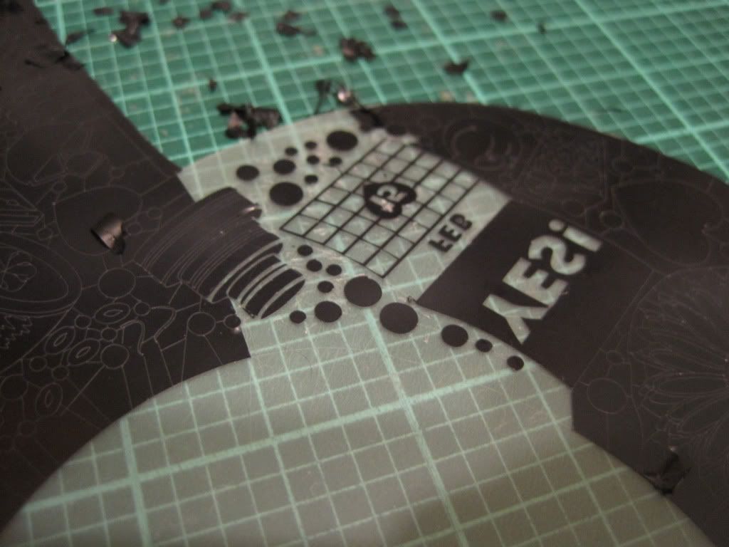
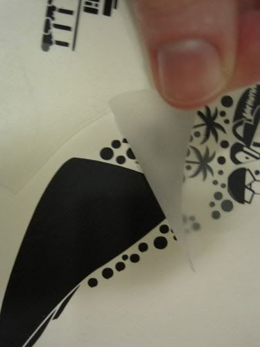
The sad thing about diecutters is that we haven't yet figured out how to get them to be our weeding slaves. Yes, that loathesome chore of weeding from when we were kids comes right back when we're using diecutters. The term "weeding" refers to removing the waste material from around your design. For a complex design like this, it takes a while. Honestly, I put on a movie while I did it. The detail of this project required a lot of attention and I think I got a little more crosseyed because of it (woot strabismus!).
Starting...
more...
a little more...
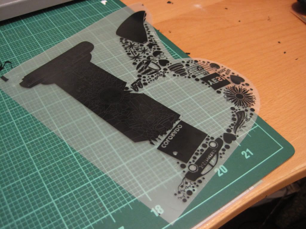
still not done...
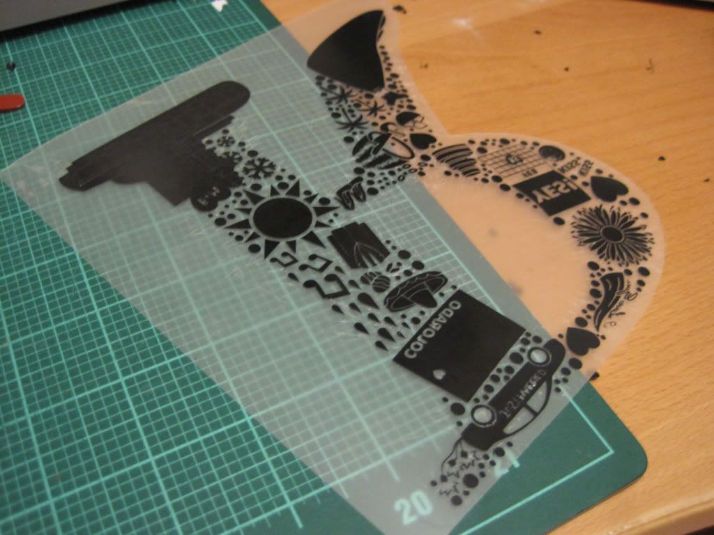
SO MUCH WEEDING!1!!!11
Did you see those nice, neat cuts between individual items? I call those "helper lines" and they have to be drawn in manually. Once you get familiar with the pull and personality of vinyl, you learn how to draw them to allow you to more easily remove the scrape material while not disturbing the wanted material.
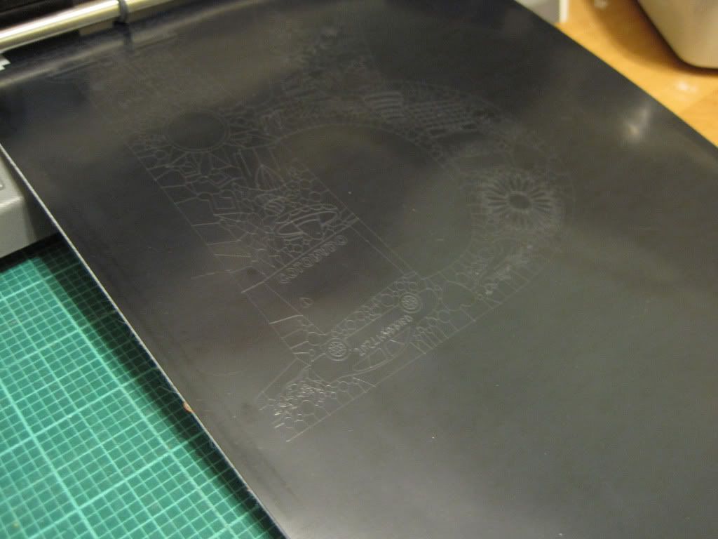
This is what the project ended up looking like when I sent it to the cutter. Black shapes are "keepers" and the pink lines are helper lines. It took 25 minutes to cut, which is incredible given that most of what I send to my cutter takes two minutes tops. Certainly an indication to simplify things the next time I make one of these.
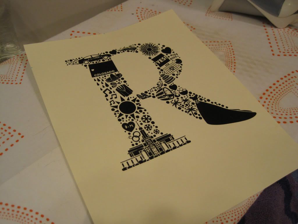
And voila, done!
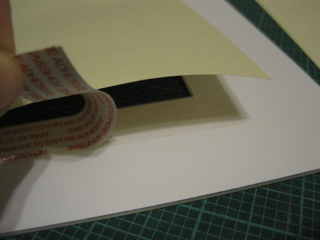
If you go this route you'll need to attach it to your chosen backing material to be installed in the frame. Here's where you check the manufacturer's instructions about iron settings and if you need to mirror the image, as I had to, but in my case, that was simply centering the design on my page and then pressing with a dry iron (through a scrap piece of paper). Then it was just a matter of carefully pulling up the transfer plastic and it was done.
I should note here that I failed to center it properly and had to modify my overall design (or recut the whole thing). Yes, even I make stupid mistakes. If you're concerned that you'll do what I did, you can always mount it to a larger piece of paper and trim it down, or just go by the adage of "measure twice, cut once". Sometimes I really wish life had a Command+Z.
If this diecutting business seems to be too much, you can always print out the darn design and spare yourself the drama and gray hairs.
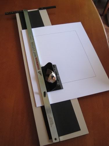
With that done, it was time to cut the matting. I've cut a few mats in my day (mostly for awards to present to employees at my company), so here's how I do it.
First, I create a template of my cut lines of the matting. I can measure and mark up the back of my matting all day, and it is still never right. This is the only way that keeps things precise for me.
Then, I spray glue it to the back of my matting material. I trim off the scrap at this point too.
Then, using a mat cutter (these come in many flavors, but I have had good luck with this Logan model), cut out the beveled interior. It's important to remember that this cut is a bevel, so you have to make sure you have your matting loaded correctly into the cutter. In my case, I always cut to the outside of the piece. With the right tools and a little practice, matting is actually really stinking easy to do, and then you don't have to limit yourself to what is available commercially.
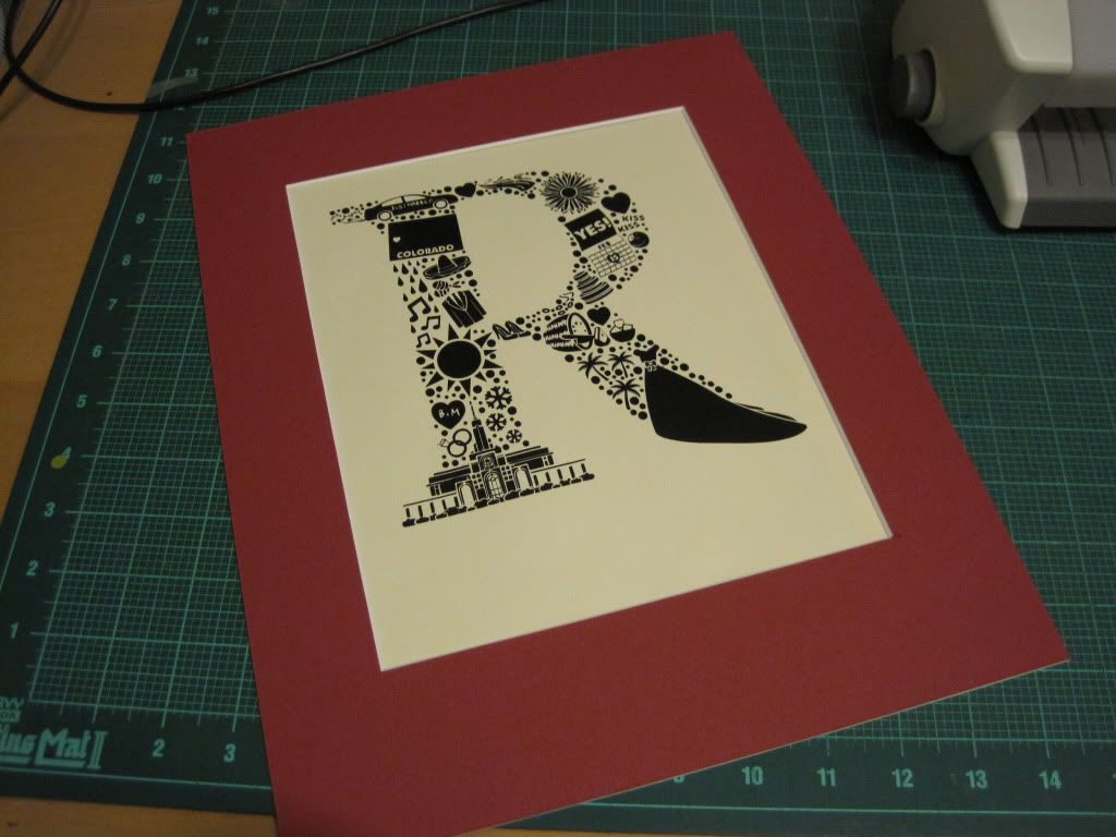
Done!
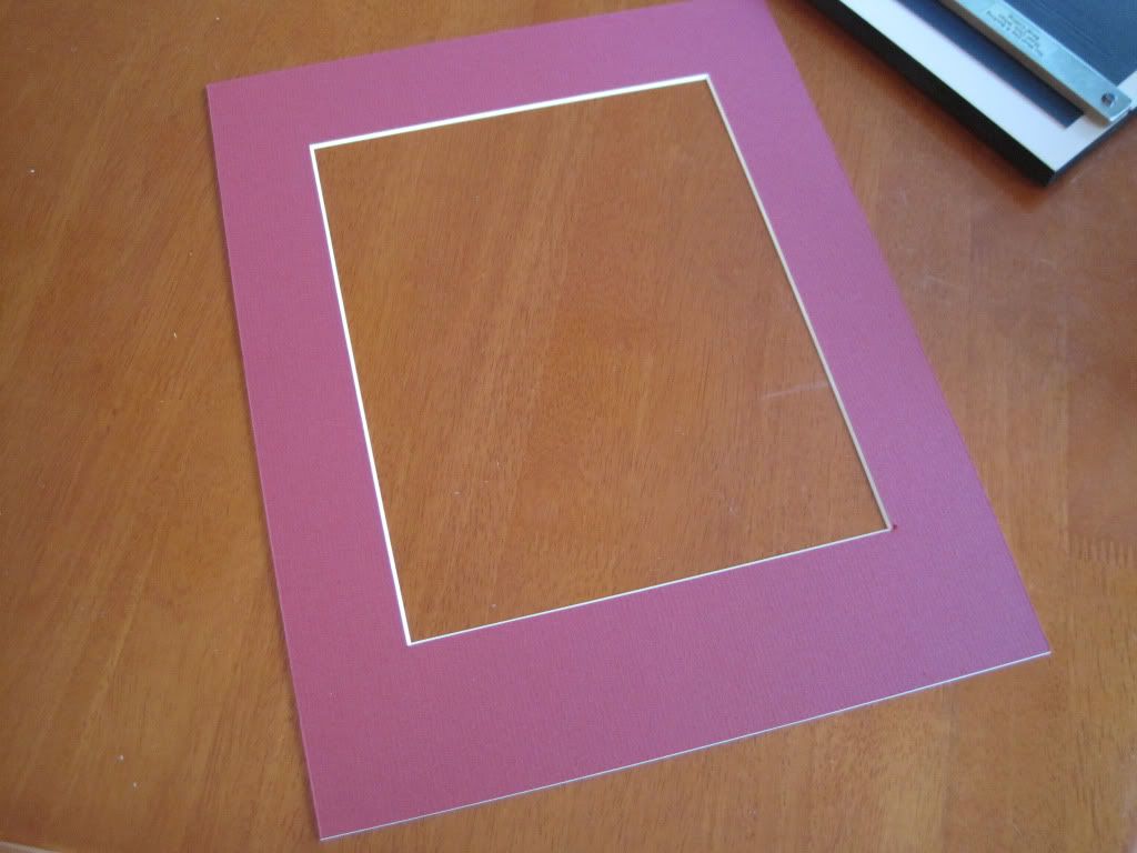
Then, using poster tape, affix the artwork to the backside. Here comes the conversation about using acid free materials and my stance is you are welcome to use them if you want. I don't because I'm cheap and I plan to tell my friend to keep this piece out of sunlight.
Finished matted piece. Fortunately, with some fancy footwork learned from years of screwing things up, you can barely tell that I didn't get the R centered correctly.
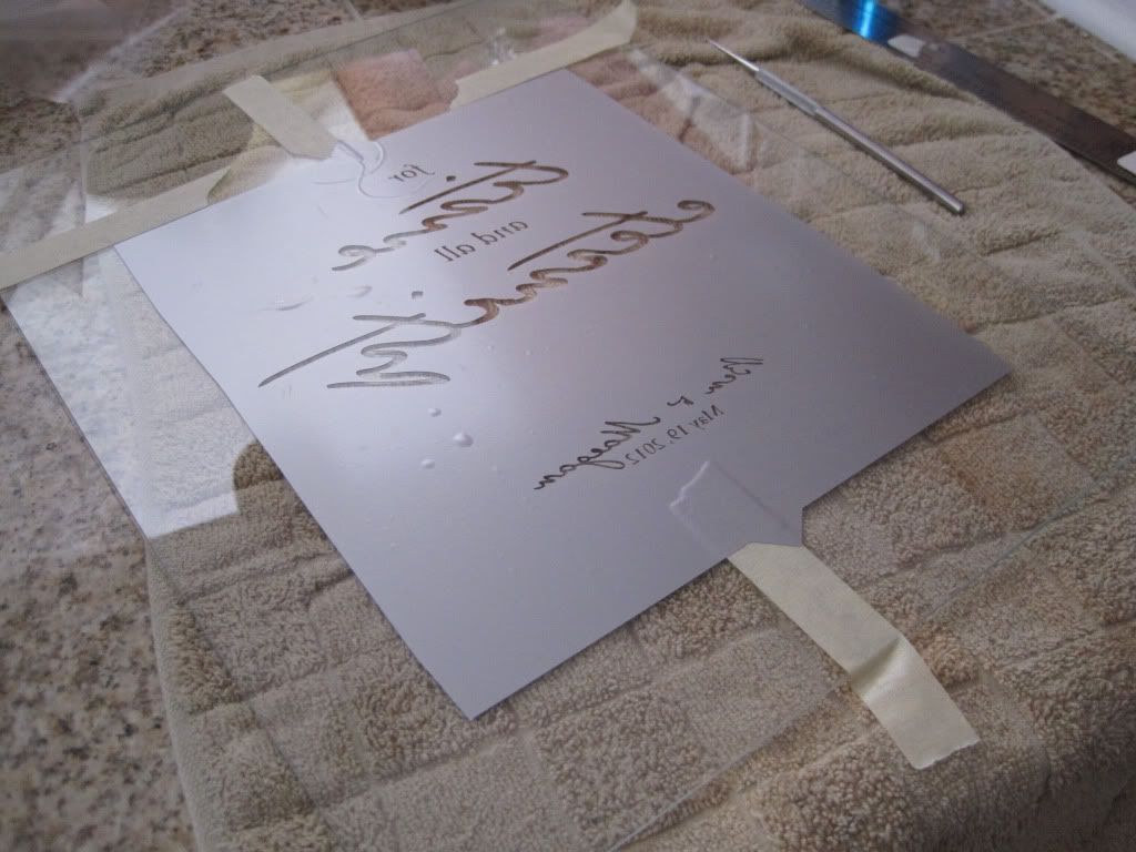
Next, the terrifying task of etching the glass. I say terrifying because this is the only material that I don't have spares of and there's no going back. Patience and care is rewarded here.
Using my diecutter, I created a vinyl template and oh so carefully attached it to my glass. You can see some more detailed instructions on how I etch here. Note that my etching is reversed because I'm going to etch the inside of the glass so that one can't run their fingers over the lettering and feel it. Fit and finish details, guys. I also switched to using a "wall-friendly" vinyl product with a lighter tack adhesive and had excellent results, and once I rinsed off the etching paste the vinyl basically fell off the glass! So easy!
I should also note that when a freshly etched piece comes out of its rinsing and removing the stencil, you can't see the etching. I always seem to forget this and was crapping bricks for a solid minute while I gave the glass a good cleaning and then finally, the etching showed up. I seriously thought my etching goo was too old and had only worked enough to prevent me from reusing the glass. I have bad luck with projects sometimes.
Today was nice to me, at least.
Frame it up, and you're done!
If you want the etching to show up a bit clearer, you'll need to add a small spacer between the glass and matting. Depending on your frame, this may make your art too thick to be able to secure the backing in the supplied grooves. The way around this is to use glazier points to secure the backing (get them at Home Depot in the hardware aisle, with the picture hanging stuff) and then make your own hanging wire. I opted not to because I don't trust this frame to tolerate funny business.
To finish it up, I created a simple page explaining all the images. I do this so nobody has to remember what each thing means, but also there are details of the day that I picked up on that perhaps Maegan didn't in the hubbub of it all.
Attached it to the back, packed it up, and off to FedEx encased in an entire roll of bubble wrap!
And then, there were gratuitous artsy pictures showing the detail of the piece.
So, there you go! An easy and doable project for anyone with a sense of adventure and some basic drawing skills. And, there are fun things to come for the blog - I'm learning stained glass and have to make four (4!!!) more quiet books this year! Oy!


This is amazing! I love it :)
ReplyDelete